Take a minute to write an introduction that is short, sweet, and to the point.
Introduce your brand
Take a minute to write an introduction that is short, sweet, and to the point.
BRIGHT.
Dream it.
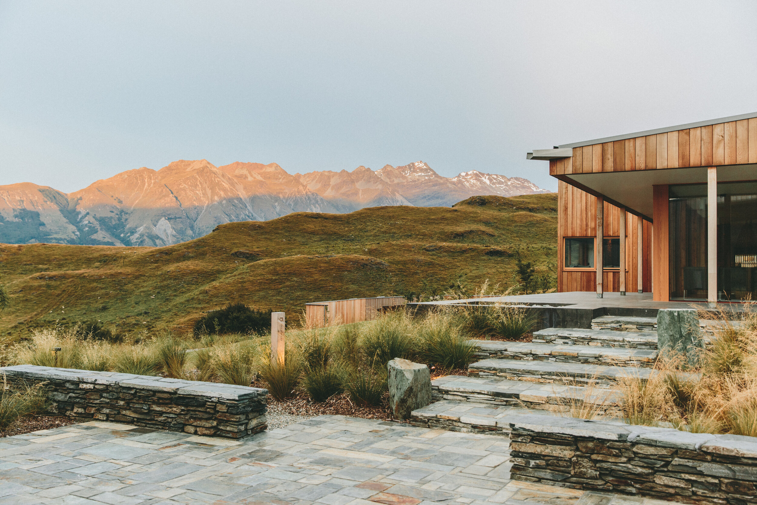
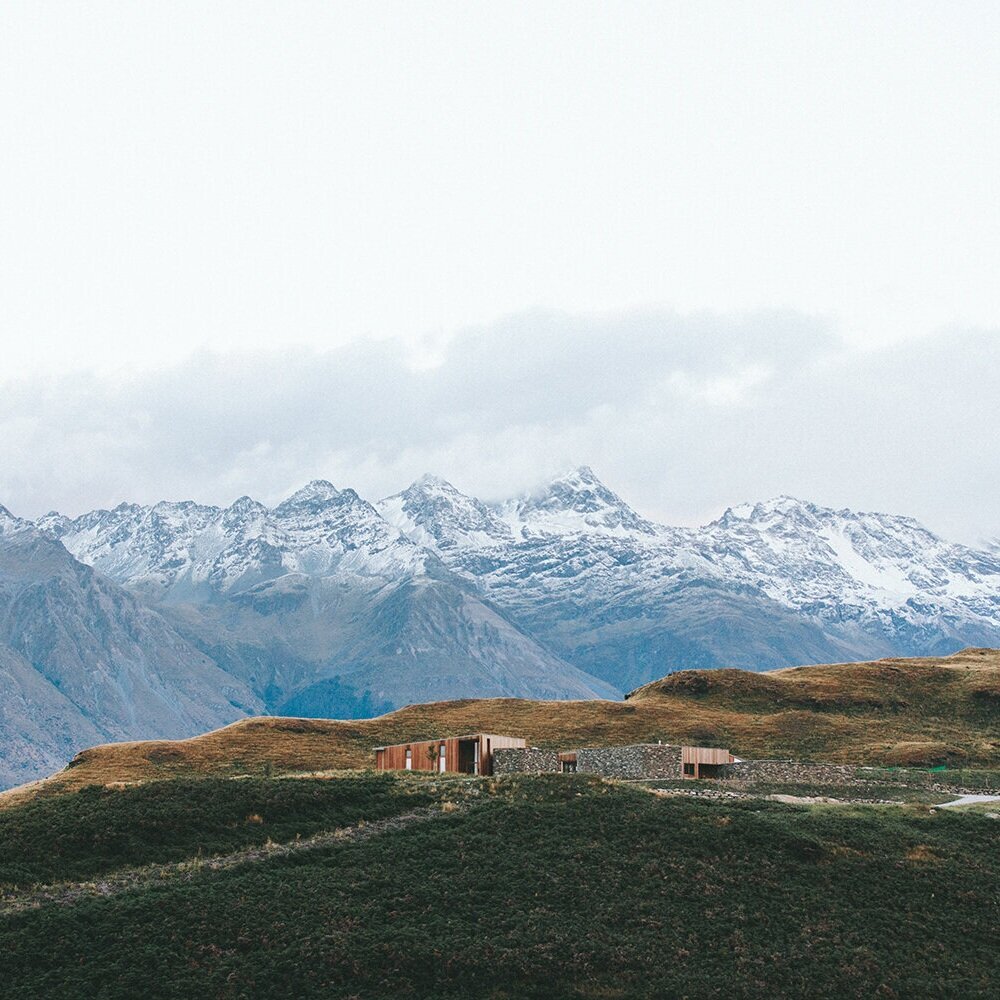
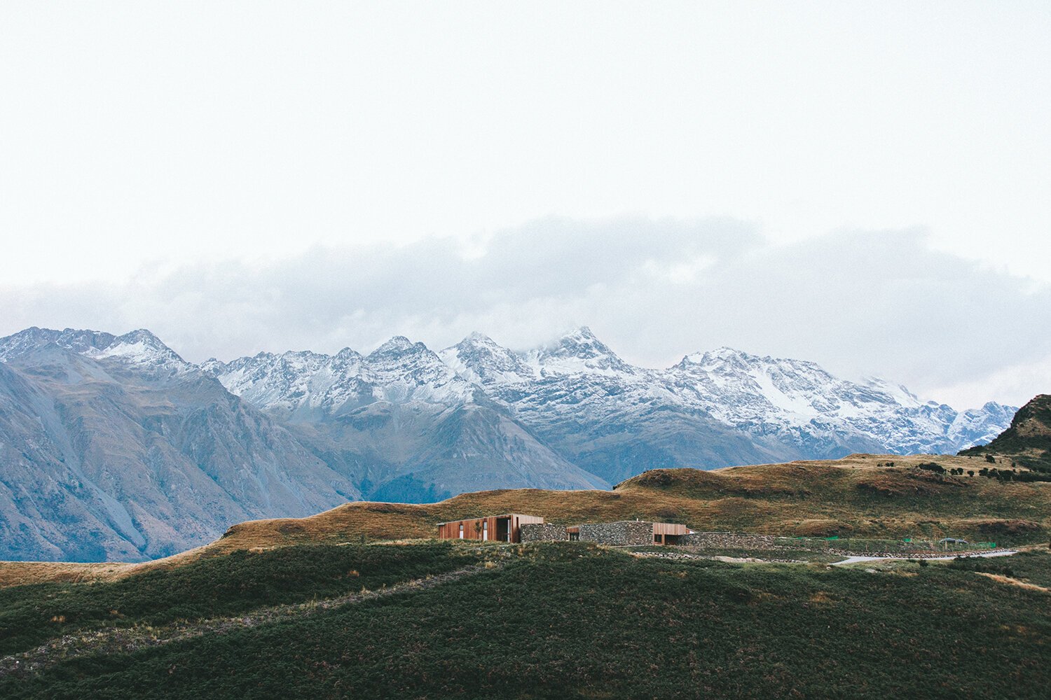
It all begins with an idea. Maybe you want to launch a business. Maybe you want to turn a hobby into something more. Or maybe you have a creative project to share with the world. Whatever it is, the way you tell your story online can make all the difference.

Build it.
It all begins with an idea. Maybe you want to launch a business. Maybe you want to turn a hobby into something more. Or maybe you have a creative project to share with the world. Whatever it is, the way you tell your story online can make all the difference.

Living out loud.
It all begins with an idea. A desire to reduce suffering for someone, somewhere.
Title
Title

Bright 1 Style H1
About the theme H3
There should be at least two grid spaces of negative space between all elements, unless a layered look is desired.
If highlights are used in H3 or H4, they should span the entire heading. Highlights in H1 & H2 can be individual words. Multiple highlights can be used in the same heading. Use different styles and colors to emphasize different words (i.e. underline, circle, etc). Animation is encouraged. 0.25 em is a good thickness for most highlights. End caps should be rounded. Limit highlight colors to bright teal and off-white in this theme.
In a accent box, the top edge of the header box should align with the second row of grid spaces.
There should be at least one grid space between all headings and all paragraphs. Consider leaving two grid spaces between headings and paragraphs. In this sample, there are two grid spaces between the header and the paragraph text.
Leave at least one grid space between the end of a text box and a button. Consider leaving two grid spaces as shown here.
Light accent boxes can be used with this Color Theme including light pink, off-white, and bright teal. Dark accent boxes should be avoided.
Headings
H3 should not be used with light accent boxes. The light teal color will not provide enough contrast against a light accent box.
Highlights
Using Accent Boxes
Parameters cont.
Element Spacing
Text styles
Paragraphs
Because P1, P2, and P3 are all off-white in this theme, any text placed on a light accent box will need to be manually changed to black from the site’s color palette.
Text box width
There are two options for text box width. The width can be equivalent to one grid space smaller (on each side) than the accent box (show in pink box). Or the width can be one grid space smaller on the left and two grid spaces smaller on the right as shown here.
Dimensions
Colors
Accent Boxes
The height of an accent box or shape should be at 2 to 3 grid spaces longer than the last line of text. When Left aligned, text boxes should align with the left-most edge of the second column of grid spaces.
Always drag upwards on the edge of a text box until the red line indicates you cannot drag any further. You may have to delete some lines from the text box that do not have text.

H
The section length should always be at least 4 grid spaces longer than the lowest placed element.
Element
Alignment
If a button is layered over an image or an accent box, the Secondary Button style should be used. With this style there is an outline around the button that will help create contract against images.
In the Bright 1 Theme, the background color is bright coral. H1 is dark black, H2 is black, H3 is bright teal, H4 is black.
The primary button is black, with off-white text. The secondary button is a bright teal pill with off-white outline and text, and the tertiary button is a black square, with bright teal text.
The paragraph text is off-white for P1, and black for P2, and P3. If using P1 or P2 text directly on the bright coral background, the text color should be manually changed to off-white.
Lightest 2 Style H1
About the theme H4
There should be at least two grid spaces of negative space between all elements, unless a layered look is desired.

If highlights are used in H3 or H4, they should span the entire heading. Highlights in H1 & H2 can be individual words. Multiple highlights can be used in the same heading. Use different styles and colors to emphasize different words (i.e. underline, circle, etc). Animation is encouraged. 0.25 em is a good thickness for most highlights. End caps should be rounded. Limit highlights to bright teal and black for this theme.
In a accent box, the top edge of the header box should align with the second row of grid spaces.
There should be at least one grid space between all headings and all paragraphs. Consider leaving two grid spaces between headings and paragraphs. In this sample, there is one grid space between the header and the paragraph text.
Leave at least one grid space between the end of a text box and a button. Consider leaving two grid spaces as shown here.
Light accent boxes can be used with this Color Theme including light pink and bright teal. These medium shade accent boxes can also be used: medium teal & bright coral.
Headings
H3 and H4 headings can be manually changed to bright coral to create contrast where needed.
Highlights
Using Accent Boxes
Element Spacing
Text styles
Paragraphs
The default P1, P2, and P3 text color is black in this theme. Text placed on a dark or medium colored accent box may need to be manually changed to off-white from the site’s color palette.
Text box width
There are two options for text box width. The width can be equivalent to one grid space smaller (on each side) than the accent box (show in pink box). Or the width can be one grid space smaller on the left and two grid spaces smaller on the right as shown here.
Dimensions
Colors
Accent Boxes
The height of an accent box or shape should be at 2 to 3 grid spaces longer than the last line of text. When Left aligned, text boxes should align with the left-most edge of the second column of grid spaces.
Always drag upwards on the edge of a text box until the red line indicates you cannot drag any further. You may have to delete some lines from the text box that do not have text.
Element
Alignment
If a button is layered over an image or an accent box, the Secondary Button style should be used. With this style there is an outline around the button that will help create contract against images.
In the Lightest 2 Theme, the background color is off-white. H1, H2, H3, and H4 are all black. Bright coral can be used as an alternate heading color when the heading is placed directly against the off-white background. This change can be made manually.
The primary button is bright coral with off-white text. The secondary button is black pill with off-white outline and text, and the tertiary button is a black square with off-white teal text.
The paragraph text is black for P1, P2, and P3. If using text on a dark accent shape, the paragraph text color should be manually changed to off-white or pink.
Images
Accent boxes can be layered over images or nestled behind them.
Dark 1 Color Style H1
About the theme H3
There should be at least two grid spaces of negative space between all elements, unless a layered look is desired.
If highlights are used in H3 or H4, they should span the entire heading. Highlights in H1 & H2 can be individual words. Multiple highlights can be used in the same heading. Use different styles used to emphasize different words (i.e. underline, circle, etc). Animation is encouraged for H1 an H2 highlights. 0.2-0.25 em is a good thickness for most highlights. End caps should be rounded. Limit highlights to bright teal and bright coral for this theme.
In a accent box, the top edge of the header box should align with the second row of grid spaces.
There should be at least one grid space between all headings and all paragraphs. Consider leaving two grid spaces between headings and paragraphs. In this sample, there is one grid space between the header and the paragraph text.
Leave at least one grid space between the end of a text box and a button. Consider leaving two grid spaces as shown here.
Light accent boxes can be used with this Color Theme including off-white and bright teal. Dark accent boxes should not be used. Medium teal may also be used. The use of bright coral as an accent box should be minimal (less than 10% of the section content).
Headings
H3 should not be used with light accent boxes. The off-white color will not provide enough contrast against a light accent box.
Highlights
Using Accent Boxes
Parameters cont.
Element Spacing
Text styles H2
Paragraphs
The default color for P1 for this style is off-white. P2 and P3 are dark teal in this theme. Any text placed on a light accent box will need to be manually changed to dark teal from the site’s color palette if this is not the default. Manually change the text color to ff-white if using this color (medium-teal) for the accent box.
Text box width
There are two options for text box width. The width can be equivalent to one grid space smaller (on each side) than the accent box (show in pink box). Or the width can be one grid space smaller on the left and two grid spaces smaller on the right as shown here.
Dimensions
Colors H2
Accent Boxes H4
The height of an accent box or shape should be at 2 to 3 grid spaces longer than the last line of text. When Left aligned, text boxes should align with the left-most edge of the second column of grid spaces.
Always drag upwards on the edge of a text box until the red line indicates you cannot drag any further. You may have to delete some lines from the text box that do not have text.
Element
Alignment
If a button is layered over an image or an accent box, the Secondary Button style should be used. With this style there is an outline around the button that will help create contract against images.
In the Dark 1 Theme, the background color is dark teal. H1 is bright teal, H2 is black, H3 is off-white, and H4 is bright coral.
The primary button is bright teal with black text. The secondary button is a bright coral pill with off-white outline and text, and the tertiary button is an off-white square with black text.
Images
Accent boxes can be layered over images or nestled behind them.
Light 1 Style H1
About the theme (H4)
There should be at least two grid spaces of negative space between all elements, unless a layered look is desired.
The H3 heading should not be used directly against the light pink background. However, it can be used when paired with a dark accent shape.
There should be at least one grid space between all headings and all paragraphs. Consider leaving two grid spaces between headings and paragraphs.
Light accent boxes can be used with this Color Theme as well as dark accent boxes. Because P1, P2, and P3 are all black in this theme, any text placed on a dark accent box will need to be manually changed to the light pink or off-white colors from the site’s color palette.
Element Spacing & Button Use
Spacing Cont.
In a accent box, the top edge of the header box should align with the second row of grid spaces.
There should be at least one grid space between all headings and all paragraphs. Consider leaving two grid spaces between headings and paragraphs. In this sample, there is one grid space between the header and the paragraph text.
Leave at least one grid space between the end of a text box and a button. Consider leaving two grid spaces as shown here.
If using off-white or lightest teal as an accent box, manually change the font color to the darkest red.
H2 Title
Use H1, H2, or H4 as headers on a light accent box. Do not use H3 since there will not be enough contrast.
Using Headers & Accent Boxes
When to use H1, H2, H3, & H4
H3 Title
H2 Title
Manually change text to pink or off-white if using this background color
The size of an accent box or shape should be at 2 to 3 grid spaces longer than the last line of text. When Left alighned, text boxes should align with the left-most edge of the second column of grid spaces.
Always drag upwards on the edge of a text box until the red line indicates you cannot drag any further. You may have to delete some lines from the text box that do not have text.
H4 Title
P3 when H4 is a stand alone title use P3 for the text box
P3 Over a off-white accent box, use only the darkest colors
Element
Manually change text to pink or off-white cream if using this back
If a button is layered over an image or an accent box, the Secondary Button style should be used. With this style there is an outline around the button that will help create contract against images.
Manually change text to pink or off-white if using this background color
Stacking
In the Light 1 style theme, the background color is light pink. H1 is dark red, H2 is black, H3 is off-white, H4 is black.
The primary button is black, with off-white text. The secondary button is black pill with off-white outline and text, and the tertiary button is square, off-white, with black text.
The paragraph text is black for P1, P2, and P3. If using text on a dark accent shape, the paragraph text color should be manually changed to off-white or pink.
If using text on a light-colored accent box (off-white or light teal) the paragraph text color should be manually changed to the darkest red.
Light 2 Theme
H3 Title
In the Light 2 style theme, the background color is light blue. H1 is black, H2 is dark teal, H3 is bright coral, H4 is off-white.
The primary button is dark teal, with off-white text. The secondary button is bright coral with off-white text and the tertiary button is square, dark teal with off-white text.
H4 Title
Use P2 with dark accent boxes or manually change text to pink or off-white. Use secondary button if placing a button over this color. The secondary button is bright coral with an off-white outline. It will help to create contrast.
H1 Title
H3 Title
Only use P1 or P3 if placing text directly on this background. If P2 size is desired, manually change text color to dark teal using the color palette.
P2 is off-white in this theme. P1 and P3 are dark teal.
H2 Title
P2 is off-white in this theme. P1 and P3 are dark teal.
H3 Title
H4 Title
Only use P1 or P3 if placing text directly on this background.
Since P2 is an off-white color it will not create enough contrast.
H1
Title
Headings on an off-white accent box in this theme should be Black (H1) or Coral (H3) or Dark Teal (H2).
H1 Title
Only use P1 or P3 if placing text on the background (light blue) or an accent shape of this color (off white).
Be sure there are at least two full grid spaces between a text box and a button.
Always drag upwards on the edge of a text box until the red line indicates you cannot drag any further. You may have to delete some lines from the text box that do not have text.
The size of an accent box or shape should be at 2 to 3 grid spaces longer than the last line of text. When Left alighned, text boxes should align with the left-most edge of the second column of grid spaces.
P2 is off-white in this theme. P1 and P3 are dark teal.
H2 Title
H4 Title
P2 is off-white in this theme. P1 and P3 are dark teal.

Make it
It all begins with an idea. Maybe you want to launch a business. Maybe you want to turn a hobby into something more. Or maybe you have a creative project to share with the world.
Lightest 1
H4 Title
Use this stylewhen you want light text to appear over a darker shape.
H3 Title
Use this stylewhen you want light text to appear over a darker shape.
H2
Use this stylewhen you want light text to appear over a darker shape.
H2 Title
Use this stylewhen you want light text to appear over a darker shape.
H2 Title
P2 use this stylewhen you want light text to appear over a darker shape.
H2 Title
Use this stylewhen you want light text to appear over a darker shape.
H4 Title
P3
Use this stylewhen you want light text to appear over a darker shape.
Make it stand out.
Make it stand out.
-
![]()
“It all begins with an idea. Maybe you want to launch a business.”
-
![]()
“It all begins with an idea. Maybe you want to launch a business.”
-
![]()
“It all begins with an idea. Maybe you want to launch a business.”
-
![]()
“It all begins with an idea. Maybe you want to launch a business.”